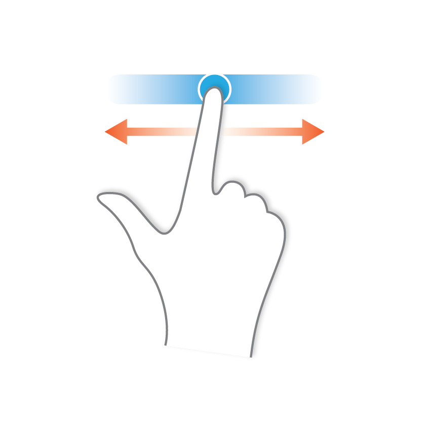
Drag
Change time multiplier

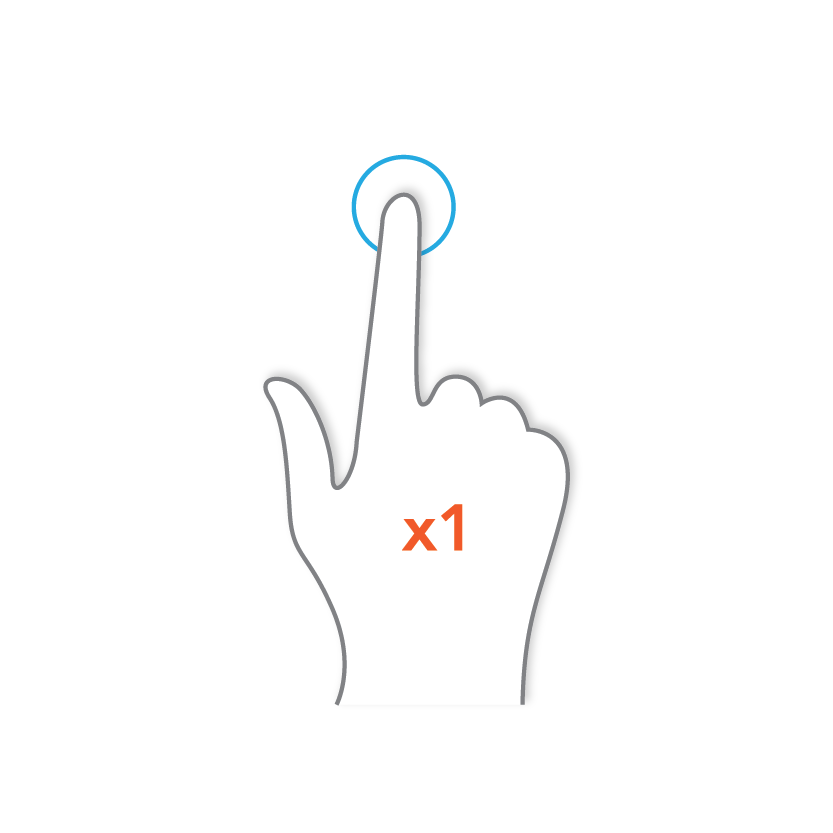
Tap
Choose a planet to compare it with Earth

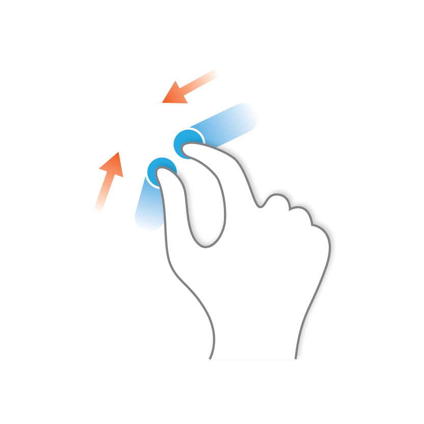
Pinch close
Reveal outer planets in solar view

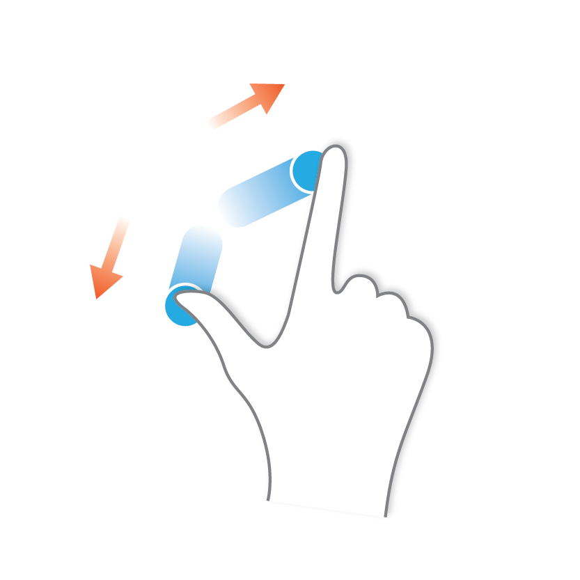
Pinch open
Reveal inner planets in solar view
Gesture images by "GRPH3B18", available under the Creative Commons Attribution-Share Alike 3.0 Unported license.
Solar view
Explore our solar system! In this view you can observe the duration of a year on different planets in the solar system. Get a feeling for the distances between the planets, especially when switching to the outer solar system. Also note that the starting points of the arcs show you the current position of the planet.
Day view
Click on any planet to get into the day view. Compare the selected planet with our well known Earth. Get an impression of planet sizes. The arcs visualize how long a day on a particular planet is. The colors are a representative average of real color images of the planets.
This design exercise concentrates on visualizing data or a topic without using typography or other user interface elements like buttons.
The challenge is to use only parameters like shapes, colors and positioning and still be able to communicate the information. For example, the arc representing the Earth is a bit wider, this additional clue indicates that this arc is somehow important. I chose this topic for the project out of personal interest and because I want to let people realize the enormous dimensions of space. When talking to people about this topic I often hear that it's really hard to imagine these sizes and distances. And with the project I want to inform about our solar system in an abstract way.
The project is realized with javascript mainly with D3.js. Check out the source on GitHub for details.
This project was part of my interaction design studies at HfG Schwäbisch Gmünd.
2th semester, “Programmiertes Entwerfen”.
Advisor: Prof. Jens Döring, Prof. Michael Götte